

Blog by Sanwariya Packaging

Your Trusted Partner in Packaging

Learn About Our Vision for the Future And Grow with Us.

Your Trusted Partner in Pharma Packaging

Learn about our vision for the future and grow with us.

Your Trusted Partner
in Pharma Packaging

Learn about our vision for the future and grow with us.

Know More

Tag: pharmaceutical foil printing

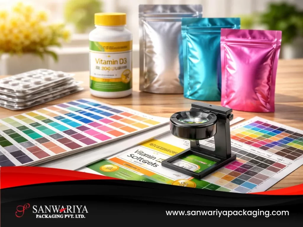
Importance of accurate foil colors for compliance

Pharmaceutical packaging must communicate critical information clearly and consistently. From dosage instructions to product identification, every element printed on a medicine package plays a role in ensuring safe and effective use. 

Color is one of the most important visual tools used in pharmaceutical labeling. Specific colors may be associated with dosage strengths, product variations, warnings, or brand identity. 

Because of this, maintaining accurate and consistent color printing on pharmaceutical packaging materials is essential. In blister packaging, printed aluminum foils often carry product names, dosage details, batch information, and regulatory text. If the printed colors deviate from approved standards, it can affect readability, create labeling confusion, or lead to regulatory compliance concerns. 

This blog explains why color accuracy matters in pharmaceutical foil printing, how regulatory readability requirements influence labeling design, and how packaging teams maintain consistent color reproduction during production.

The Role of Color in Pharmaceutical Labeling

Color is widely used in pharmaceutical packaging to support quick visual identification. Healthcare professionals, pharmacists, and patients often rely on packaging colors to differentiate between similar medicines or dosage strengths.

In many cases, color schemes are intentionally standardized across product lines to reduce the risk of medication errors.

Common uses of color in pharmaceutical packaging include:

  • Distinguishing dosage strengths of the same medicine
  • Identifying different formulations or product variants
  • Highlighting warnings or safety information
  • Reinforcing brand recognition and product identity

When colors remain consistent across batches and packaging formats, they help users quickly identify the correct product.

However, if the printed color on a blister foil deviates from the approved design, it may create confusion or reduce labeling clarity.

Color Matching Standards in Pharmaceutical Printing

Pharmaceutical packaging artwork typically specifies precise color values that must be reproduced accurately during printing. These values may be defined using industry-standard color systems such as Pantone or CMYK references.

Packaging development and artwork teams establish these color specifications during the design stage to ensure that every production batch maintains the same visual appearance.

Maintaining accurate color reproduction requires careful control of several printing variables:

  • Ink formulation and pigment stability
  • Printing press calibration
  • Substrate surface characteristics
  • Drying and curing conditions

Even small variations in these factors can cause noticeable differences in printed color shades.

For pharmaceutical packaging, maintaining tight color tolerances helps ensure that the printed foil remains consistent with approved artwork specifications.

Regulatory Expectations for Readability

Regulatory authorities require pharmaceutical labels to be clear, legible, and easily readable. While regulations may not always specify exact color codes, they emphasize the importance of contrast and clarity in labeling.

Label text must remain easily readable against the background color of the packaging material.

Several design considerations help maintain readability:

  • Sufficient contrast between text and background colors
  • Consistent color reproduction across production batches
  • Clear differentiation between product variants
  • Avoidance of colors that reduce legibility
If printed colors appear too light, too dark, or inconsistent with the approved design, readability may be affected. Maintaining accurate color reproduction therefore supports both labeling clarity and regulatory compliance.

Risks of Shade Deviation in Pharmaceutical Foils

Shade deviation occurs when the printed color on packaging differs from the approved color standard. This can happen due to variations in ink mixing, printing conditions, or material properties.

In pharmaceutical packaging, shade deviations can lead to several operational challenges.

  • Mismatch between approved artwork and printed packaging
  • Reduced readability of critical labeling information
  • Confusion between similar dosage strengths
  • Batch rejections during quality inspection
Because packaging artwork is typically approved as part of regulatory submissions, significant color deviations may require investigation or corrective actions. For this reason, maintaining tight color control is a priority during printed foil production.

Printing Challenges on Aluminum Foil Surfaces

Printing on aluminum foil presents unique technical challenges compared with printing on paper or plastic substrates.

The reflective nature of aluminum can influence how inks appear once printed and cured. Surface coatings applied to the foil may also affect ink adhesion and color intensity.

Printing teams therefore evaluate several factors to maintain accurate color reproduction.

  • Compatibility between inks and foil coatings
  • Controlled printing pressure and registration
  • Precise ink density control during production
  • Stable drying and curing conditions

These variables must be carefully managed to ensure that the final printed color matches the approved artwork specifications.

High-quality printing processes help maintain consistency across large production volumes.

Color Calibration and Process Control

Maintaining consistent color reproduction requires systematic monitoring during the printing process.

Production teams often use calibrated color measurement tools to compare printed samples against the approved color standards.

Typical color control practices may include:

  • Calibration of printing equipment before production runs
  • Measurement of printed color values using spectrophotometers
  • Comparison of printed samples against reference standards
  • Periodic verification throughout the production process

These controls help ensure that the printed foil remains within acceptable color tolerance limits.

When deviations are detected early, adjustments can be made before large production volumes are affected.

Supporting Clear Communication for Patients and Healthcare Professionals

Clear pharmaceutical labeling is essential for patient safety. When packaging colors remain consistent and readable, healthcare professionals and patients can more easily identify medicines and follow correct usage instructions.

Accurate color reproduction also supports brand consistency and reduces the risk of confusion between similar products.

For pharmaceutical companies managing large product portfolios, maintaining color consistency across packaging formats is an important aspect of quality control.

Packaging materials and printing processes must therefore support reliable color stability throughout the product lifecycle.

Ensuring Reliable Color Consistency in Pharmaceutical Packaging

Color accuracy in pharmaceutical foil printing is more than a design consideration. It plays a direct role in maintaining labeling clarity, regulatory compliance, and product identification.

By following strict color matching standards and controlling printing conditions, pharmaceutical companies can ensure that printed foils consistently match approved artwork specifications.

Accurate color reproduction helps prevent shade deviations, supports readability requirements, and maintains the integrity of pharmaceutical labeling systems.

Sanwariya Packaging manufactures pharmaceutical aluminum foils designed to deliver high-quality color reproduction, consistent print alignment, and reliable performance during large-scale production. Through advanced printing capabilities and controlled processes supported by its infrastructure, Sanwariya Packaging supports pharmaceutical companies in maintaining precise labeling standards across global packaging operations.

For further details or project discussions, you can get in touch with us or directly request a quote.


Peel strength and seal performance in pharma blisters

Printed aluminum foils used in pharmaceutical blister packaging such as Blister Foils do more than protect medicines. They also carry critical information that patients, pharmacists, and healthcare professionals rely on every day. Batch numbers, expiry dates, dosage instructions, and regulatory warnings must remain clearly visible throughout the product’s life cycle.

Because of this, the surface finish of printed foil plays an important role in pharmaceutical packaging design. The finish affects how easily text can be read, how the package appears under different lighting conditions, and how comfortably patients can handle the medicine.

Today, packaging teams increasingly evaluate different printed foil finish pharma options—including gloss, matte, and satin surfaces—to ensure optimal readability, usability, and regulatory print clarity.

This blog explains the main types of foil finishes used in pharmaceutical packaging and how they influence patient usability and packaging performance.

Why Foil Surface Finish Matters in Pharmaceutical Packaging

Pharmaceutical blister foils must balance multiple requirements at the same time:

  • clear printing of product information
  • resistance to smudging or abrasion
  • readability under different lighting conditions
  • compatibility with packaging equipment
  • compliance with regulatory labeling standards

The foil finish influences how printed text appears on the package. It can affect:

  • glare and reflection
  • contrast between background and text
  • ease of reading small printed characters
  • durability of the printed layer

For medicines that are frequently handled—such as daily prescription tablets—these factors become especially important. Poor readability or excessive glare may make it difficult for patients to read essential information printed on the blister foil.

Understanding the Main Types of Printed Foil Finishes

Pharmaceutical packaging typically uses three common types of foil finishes: gloss, matte, and satin. Each offers different visual and functional characteristics.

Gloss Foil Finish

Gloss finishes create a smooth, reflective surface that gives the foil a bright and polished appearance.

This finish is often used when packaging design requires vibrant colors and strong visual contrast. The reflective surface enhances color depth and makes printed graphics appear more vivid.

Key characteristics of gloss finishes

  • high surface shine and reflectivity
  • strong color brightness
  • visually striking packaging appearance
  • smooth surface texture

While gloss finishes can enhance brand visibility, they may also produce glare under strong lighting conditions. In some environments—such as pharmacies or hospitals with bright lighting—reflection from glossy surfaces may slightly reduce text readability.

Because of this, packaging teams often carefully evaluate gloss finishes when small regulatory text or dosage instructions must remain clearly visible.

Matte Foil Finish

Matte finishes provide a non-reflective surface that diffuses light rather than reflecting it. This creates a softer appearance and significantly reduces glare.

Matte surfaces are often preferred when print clarity and readability are primary priorities.

Key characteristics of matte finishes

  • low reflectivity
  • reduced glare under bright lighting
  • excellent readability for small text
  • subtle, non-shiny appearance

In pharmaceutical packaging, matte finishes are commonly selected for products that contain detailed labeling or extensive regulatory information.

Because the surface reduces reflections, it can make printed characters easier to read from different viewing angles.

Satin Foil Finish

Satin finishes offer a balance between gloss and matte surfaces. They provide a moderate level of shine while still controlling excessive glare.

This finish creates a smooth and refined appearance without the high reflectivity associated with gloss coatings.

Key characteristics of satin finishes

  • moderate surface sheen
  • balanced reflectivity
  • improved readability compared with high-gloss surfaces
  • premium visual appearance

Satin finishes are often chosen when packaging teams want a combination of strong visual appeal and improved usability.

They are particularly suitable for pharmaceutical brands that aim to maintain both aesthetic packaging design and practical readability.

Anti-Glare Considerations in Pharmaceutical Packaging

Glare is an important usability factor that packaging teams evaluate when selecting foil finishes.

Highly reflective surfaces may produce bright reflections when exposed to strong lighting. This can make it harder to read small printed text, particularly for patients with reduced vision.

Reducing glare improves packaging usability in several ways:

  • easier reading of dosage instructions
  • clearer visibility of expiry dates and batch numbers
  • better legibility in pharmacies and hospitals
  • improved accessibility for elderly patients

Because patient safety depends on accurate reading of packaging information, many pharmaceutical companies consider anti-glare properties when choosing foil finishes.

Regulatory Expectations for Print Clarity

Regulatory authorities around the world require that pharmaceutical packaging information remain clear, legible, and durable.

Labeling on blister foils typically includes critical information such as:

  • medicine name
  • dosage strength
  • batch number
  • manufacturing date
  • expiry date
  • regulatory symbols or warnings

If printing becomes difficult to read due to glare, poor contrast, or surface reflection, it may create compliance concerns during regulatory inspections.

As a result, regulatory affairs teams often work closely with packaging development teams when selecting foil finishes that support clear and compliant labeling.

Balancing Usability and Brand Presentation

In addition to regulatory requirements, pharmaceutical companies also consider the visual appearance of packaging.

Different foil finishes can influence how a product is perceived by patients and healthcare professionals.

For example:

  • gloss finishes may enhance brand recognition through vibrant colors
  • matte finishes emphasize clarity and professional simplicity
  • satin finishes combine visual appeal with practical readability

The final selection typically depends on the product category, branding strategy, and labeling requirements.

For medicines intended for long-term treatment or daily use, usability considerations often become the primary factor guiding finish selection.

Factors Packaging Teams Consider When Choosing Foil Finishes

Packaging development teams usually evaluate several technical and usability factors before finalizing a printed foil finish.

These may include:

  • readability of printed text under different lighting conditions
  • compatibility with printing processes
  • resistance to abrasion during handling
  • performance during blister sealing operations
  • regulatory labeling requirements across export markets

Testing printed samples under real-world conditions helps ensure that the chosen finish performs consistently during packaging, distribution, and patient use.

Supporting Patient-Friendly Pharmaceutical Packaging

The surface finish of printed blister foil may appear to be a small design detail, but it plays an important role in the usability and effectiveness of pharmaceutical packaging.

Selecting the right printed foil finish pharma option helps companies:

  • improve readability of critical product information
  • reduce glare that may affect patient usability
  • maintain regulatory labeling clarity
  • enhance the overall appearance of pharmaceutical packaging

By carefully balancing visual design with practical functionality, pharmaceutical companies can create packaging that supports both patient safety and brand presentation.

Sanwariya Packaging manufactures pharmaceutical aluminum foils with a range of printed finish options designed to support clear labeling, reliable printing performance, and consistent packaging quality. Through controlled manufacturing processes and advanced capabilities supported by its infrastructure, Sanwariya Packaging helps pharmaceutical companies develop packaging solutions that combine regulatory compliance with patient-friendly usability.

For further details or project discussions, you can get in touch with us or directly request a quote.